
Microsoft do sometimes get an unnecessarily bad rap when it comes to software. Although it's fashionable to say that they're evil, in it for the money and technically incompetent - and Clippy does make you wonder - they have produced some superb work. Excel, for instance, is one of the most useful products on the market, and is particularly notable in that its open-source alternatives are just not that good when it comes to advanced features.
(This may, of course, be because a spreadsheet application can have advanced features that are not patently ridiculous. I very much doubt that anyone has ever said "no, you should buy Word instead of its competitors because you might miss out on the AutoSummarize tool".)
In fact, Microsoft has made quite a few very good products, and I still use some of them. MSN Messenger (sorry, "Windows Live Messenger") is one of them, used because Pidgin doesn't support webcam chats, voice chats or handwriting. Gimmicks, certainly, but they are fun gimmicks and I see no point in moving away from them just yet.
The other thing that Microsoft does very well is maintaining a consistent style. This style isn't always very attractive - almost the first thing that I did when I got the (XP-running) laptop that I'm currently using was to switch off the garish, jellybean-coloured theme and use the Windows 2000 one instead. There's just something classy about blue window title bars and grey buttons, an impression that I've had because Microsoft has stayed with that style since Windows 95 came out. Despite XP trying to foist its jolly colours on me, it does at least give me the option of turning them off.
This brings us back to Windows Live Messenger, because a few days ago I installed its latest update. The update doesn't actually change very much in terms of functionality, but it does one thing that Windows Media Player 11 did before it. See if you can spot it.
This one's the previous version (from msgweb.nl)...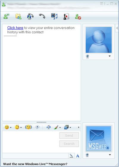
...and this is the updated version.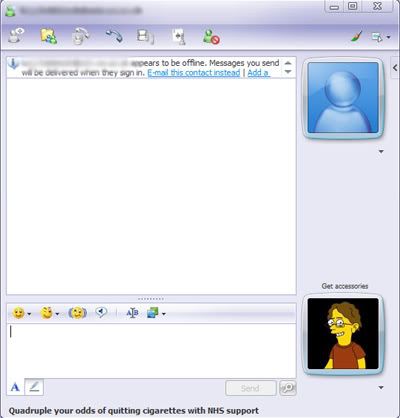
Yes, the only major difference (apart from that dashing young gentleman in the updated version) is the change in the style of the buttons up in the top right. Now, I'm aware that the buttons in the older version aren't in the standard Windows style. However, they are roughly the same size as the standard, and the icons are so similar that it still fits in with any XP theme.
I didn't realise that the new buttons were significant until I compared them with the ones in Windows Media Player 11. The design is exactly the same in that program, which tipped me off to it being a wider phenomenon. And then, of course, I saw a computer running Vista.
It's not a new theme that two programs happened to use, it's the standard Vista theme. Which is being pushed onto XP customers. In other words, they are deliberately breaking some of XP's functionality (style consistency) in order to make people want to switch to Vista.
I would say that this is one of the worst decisions that Microsoft has ever made, except that recently they have come up with some even worse ones. Internet Explorer 7, for example (which I avoided by not downloading the automatic update - seriously, who delivers an entire browser through their security patching system?), has a good try at hiding the menu bar. Windows Live Messenger does the same, but that's less noticeable as you hardly ever use the menus. And so does the latest version of Office, exchanging the menus and toolbars for an unholy blend of the two.
It may not sound like a big deal to get rid of the menu bar. But step back for a second and consider that, ever since the invention of graphical user interfaces, menus have been right there. Windows version one had a menu bar. It's not just Microsoft, either - Apple used them, the X Window System (the GUI for most Unix-like systems) uses them. Personally speaking, it is practically hardwired into my brain that if I want to open a file, I go up to the "File" menu at the top left.
In short, changing the user interface this much is a massive "SCREW YOU" to all the users who have stuck with Windows since its invention, as well as tacit confirmation that Microsoft couldn't care less about attracting Apple's customers or users of other operating systems. It is the most staggeringly bad software decision they have ever made, and has further convinced me never to get Vista.
Still, Excel is pretty good...
Thursday, 20 March 2008
RISC OS didn't use menu bars, for the record. Anyone else remember RISC OS?
![]()


3 comments:
I thought of something very witty to write in response to one of your posts recently.
I forgot it.
But I'll put a wee note here to say happy Good Friday - he's alive!
I wrote a comment the other day to this but then some wally turned my wireless internet off so I lost it!
Just because menus have been there from the beginning does not make them a necessary part of any UI. I agree they have worked, but they have worked when they have been small. If you look at the menus in Office 2003, they have become enormous; finding commands is difficult and this is frustrating for the user. Much better, IMO, to have a context-sensitive bar containing commands useful for the current operation, i.e. the Office ribbon.
As for the theme of Vista being pushed on to XP, surely as long as the UI looks good, does it really matter? And if it adds extra functions (don't know what WLM and WMP add, but you seem to like WLM!) then surely all the better?
Microsoft has of course done this before, with an update that made Windows 95 look like 98. Less people therefore bought 98!
It's true that menus aren't necessary for every purpose - any application that goes fullscreen generally does away with them to a certain extent, and games have managed without them for ages. It's also fine to modify them - recent versions of Office have made their menus context-sensitive, in a way, by hiding little-used commands.
Completely hiding the menus in a window-sized application, or screwing around with them enormously, subverts the expectations that long-time users have built up, and confuses them. As for bringing the toolbar into it, toolbars have always effectively been simplified menus, providing shortcuts so that you don't have to search the menu. Making them part of the same structure, so that you have to go hunting around no matter what you're trying to do, seems to me like an appallingly bad idea.
The Vista theme isn't quite so bad, and my problem isn't with the applications themselves. As you say, WLM is OK. My point is that they could so easily have made the theme conform to the user's current desktop theme - instead they intentionally broke that functionality in an apparent attempt to drive people towards Vista. Just seems like a cheesy attempt to force the market.
(And I don't know why you're complaining anyway, Mr Ubuntu...)
Post a Comment