
A very image-heavy post for you today, so I'm going to be kind and stick the whole lot behind a cut. All of these images are courtesy of a woman who lives just down the street from me. She's 92, and has lived in the same village all her life, which doesn't mean a lot to me until I realise that she's lived through at least part of both World Wars, and that when she was born there was no such thing as space travel, television (except in an experimental form), global communications, transistors, turbojet aircraft, helicopters (again, except experimentally) and who knows how many other things. Anyway, recently she gave my family a pile of old books, one of which - Webster's Improved Pronouncing Dictionary of the English Language - I liked so much that I've scanned a couple of bits.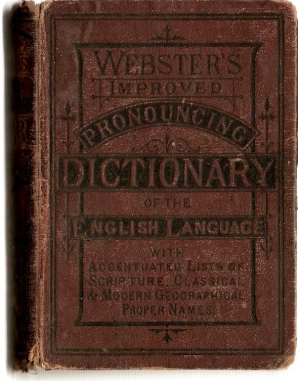
This is the front cover (all pictures are links to larger versions of themselves, by the way). I love the design here. In a way, it's very simple (text and a few lines), yet the detail just goes crazy. Making The Initial Letters Slightly Larger Than The Following Ones is a lovely touch too.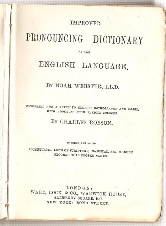
The title page is even simpler, yet still manages to be remarkably classy. The range of font sizes is huge, and it's amazing how just putting full stops after every heading immediately makes you want to read it out in an old-time radio voice. By the way, inside the front cover is an inscription from the original owner of the dictionary - it was given to its first recipient in August 1885.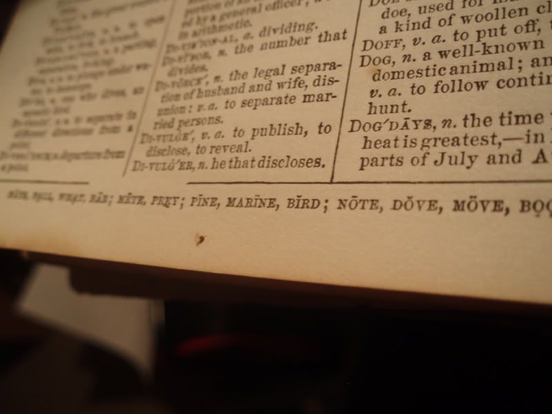
I'm skipping the dictionary's actual content because, come on, it's a dictionary, there's not going to be much you haven't seen before. Oh, except that there's a rather nifty key to the phonetic symbols running along the bottom of every page.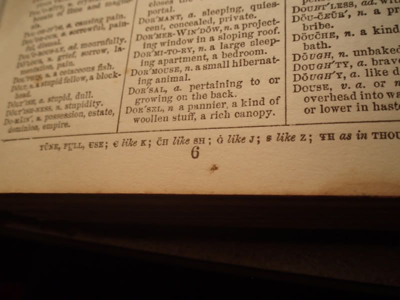
That photographic style is either very arty or is just proof that I couldn't be bothered to switch the scanner back on or dig out my tripod. You choose!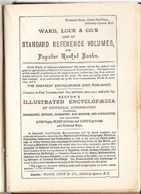
At the back of the dictionary we've got an advert for more books of knowledge. What I find fascinating about this is that by modern standards, the design is an absolute trainwreck. I think I can see four different fonts, in a vast range of sizes, with huge dense blocks of text in a tiny size. Various words are picked out by unexpectedly changing the font size and Putting Capital Letters on words. In short, it's a mess. But somehow, it still makes me want to go and buy a Beeton's Encyclopædia.
Although this dictionary isn't worth a whole lot (you can see for yourself the kind of condition it's in, apart from anything else), I think it's fantastic to have little parts of the past kicking around like this. It serves as a reminder of a time when information was much harder to find than it is today, and therefore more valuable - in a world where everything you type is automatically checked for spelling and cross-referenced to dictionaries (American ones in my case - I really need to get around to installing those extra dictionaries on Firefox) there's just no need for something like this. It's possible that having so much information available to us has devalued it; we need old objects like this to remind us that one day it could all be gone.
Oh, and quite apart from all the deep philosophical points, how can you not love a dictionary that ends like this?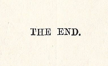
Wednesday, 19 March 2008
Ah, so that's how you pronounce "dog". I've always wondered.
![]()


No comments:
Post a Comment