In the field of computing, perhaps more than anywhere else, it's weird how some things get noticed and others just don't. This applies mainly to products - I have no idea why Microsoft Office is quite so prevalent, given its problems (see venting of extreme rage here), or indeed why iTunes seems to be used by everyone on the planet. Yes, that includes remote South American tribes who have never seen a computer.
(For the record, I don't use iTunes, partly in protest at Apple's attitude to replaceable hardware, but mainly because I really dislike that style of music player. I'm going to lose some major geek credit at this point by saying that I have yet to find a better music player than Windows Media Player 10. Just don't get me started on the utterly awful version 11.)
It's not just particular programs that get unaccountably promoted or ignored, though - aspects of these programs do as well. In particular, features get promoted over interfaces and usability. If you've got Word (or any major word processor, in fact), hit the Tools menu and have a look at all the features there. If you're anything like me, you hardly ever use any of them, except for, perhaps, Word Count. And yet, pretty much every version of Word adds new features (AutoSummarize? Really? Did anyone ever use that?), without trying to tackle underlying interface problems, such as the fact that it's so much easier to directly change font sizes and alignments than it is to use the (theoretically) much more powerful Styles system.
Microsoft isn't the only offender in this regard, although they don't help the situation. Even major standards bodies end up causing big problems - for example, Web developers using HTML these days are encouraged to use stylesheets as much as possible, rather than old solutions like the <font> and <center> tags. The problem with this is that for some tasks, stylesheets are an appalling idea. It's much easier for me to make text bold by typing <b></b> tags than it is to use inline style, which would require me to type "<span style="font-weight:bold;"></span>" every time I wanted to add a little emphasis to my text.
With this in mind, it's refreshing to come across programs that concentrate on making tasks work as well as they can, in exactly the way that the users expect. At the risk of sounding like something of a fanboy, I have to say that Google's products buck the trend in a particularly good way. If you cast your mind back to the dim and distant past - all right, 1999 - Altavista, one of the biggest search providers online, looked like this. Then along came Google - looking like this. Nothing but the search bar, no huge graphics - remember, most people were on dialup back then - it's no wonder that it was a big hit. Even now, the main Google page is only complicated if you want it to be, and they are well on the way to becoming the first search engine to be a sovereign nation and issue its own stamps. (Probably.)
One of Google's lesser-known products is SketchUp, which I downloaded a couple of days ago. It's a 3D modelling program - this isn't a software genre with which I'm intimately familiar, but I know enough about it to realise that trying to draw in 3D while equipped with a 2D mouse and screen is immensely difficult. This is where SketchUp's "inference engine" is so impressive. Effectively, it looks at your mouse movements and tries to guess what it was you were trying to do, then does that. This is an approach that Google uses quite a lot already, as you'll know if you've ever misspelt a word when typing it into the Google search box, but I'd never realised the power of the approach until I saw it applied to a difficult problem like this.
Obviously the engine makes mistakes - if you're trying to do anything complicated it becomes an exercise in trying to make things as easy as possible for the engine to guess your actions. The lack of functions such as "fill in the region between these lines - well, just fudge it if it doesn't quite fit, then" gets a bit annoying too, and I'm yet to quite sort out how to navigate round my models effectively. That said, it is remarkably easy to get up and running, especially if you're playing with large or simple shapes. Being able to draw a house, then poke doors and windows into the walls, is a very powerful experience, and I've more than once had to suppress a maniacal chuckle at my new-found power.
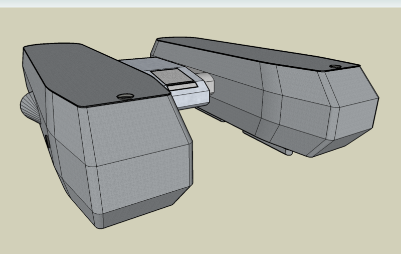
Oh, and the models you make always look fantastic, too. Have a look at a few hours' work on my newest invention, the Space Catamaran.
Maybe this is a short-lived trend, and maybe Google, too, will sink into the morass of trying to do too much without making its products remotely fun to use. (If anyone can make Google Earth's new Sky feature work at all well, give me a call.) For now, though - software geeks of the world, rejoice, for Google will conquer all.
Wednesday, 29 August 2007
Good thing "Google" is only a moderately silly name, too. Microsoft would call it something like "Enhanced Dynamic Search Facility".
Posted at
8:55 pm
![]()
Tags: computers, internet, psychology


No comments:
Post a Comment